


How to choose paint colours: a complete guide for Toronto homeowners
I've painted Toronto homes for 20 years. The colour question comes up in every quote visit, same conversation, different living room. Most homeowners want a shortcut: just tell me what looks good. That skips the two numbers that matter, LRV and undertone. Get those right, the rest sorts itself out. Get them wrong, you'll repaint inside a year.
This guide covers the LRV thresholds I use for north-facing condos versus south-facing semis, the undertone trap that wrecks most "warm white" picks, the Toronto best-sellers from Chantilly Lace to Cheating Heart, and how to test samples so you paint the room once.
Key Takeaways
- LRV (Light Reflectance Value) is the single most useful number on a paint chip. Stay above LRV 60 on main walls in north-facing Toronto rooms to fight winter light loss.
- Undertones beat hue. A "warm white" with the wrong undertone reads pink, yellow, or green in your specific light, which is why peel-and-stick samples on all four walls matter.
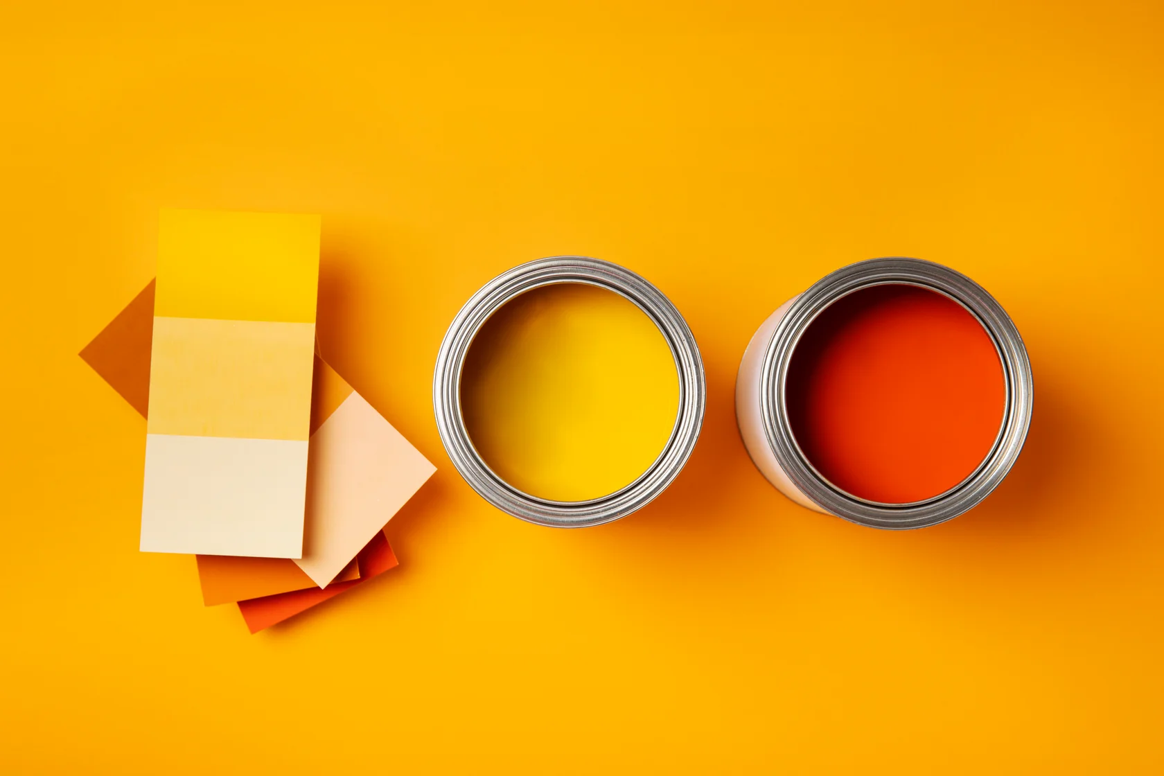
- Toronto best-sellers that hold up across condos and semis: Chantilly Lace OC-65 (LRV 83.21), Cloud White OC-130, Edgecomb Gray HC-173, Revere Pewter HC-172. Hale Navy and Cheating Heart for accents.
- Deep, saturated colours cost up to $7 CAD more per gallon across every Benjamin Moore line because they need a deep base (BM spec sheets, 2026).
- For bathrooms with daily steam, default to Aura Bath & Spa. For deep accent walls, pay the Aura premium for Color Lock. For whites and pales, Regal Select saves $20/gal with no visible trade-off.
In this guide
- Why does paint colour matter more than people think?
- What is LRV and how do I use it for Toronto light?
- How do undertones change a "warm white" into a problem?
- Which Toronto best-sellers actually work room-by-room?
- How should I test paint samples before committing?
- Why do deep accent colours cost more, and when should I pay it?
- What about exterior colour for a Toronto home?
- FAQ
Why does paint colour matter more than people think?
Walls are the biggest visual surface in any home. Paint colour swings roughly $6,271 USD in perceived value on the average listing (Zillow Paint Colour Analysis, 2018). Pick the wrong undertone on a north-facing living room and the space feels cold from October through March. Pick the right one and the same square footage reads about 20% larger to a buyer's eye.
Most colour regret in Toronto traces back to one mistake: choosing under store fluorescents, then rolling four walls without testing in the actual room. A colour that pops at the dealer counter behaves nothing like the same colour at 4 p.m. in a north-facing Liberty Village condo. I've repainted dozens of rooms where the homeowner skipped the swatch step. I can count on one hand the callbacks from clients who taped up 2x2 patches and sat with them for 72 hours.
Colour drives function too. Bedroom hue affects sleep quality, with blue and soft green walls linked to longer reported sleep than warm reds or oranges (Travelodge bedroom colour study, 2013). Kitchen colour sets buyer impressions in the first 30 seconds of a showing. Picking by mood board alone misses both levers.
What is LRV and how do I use it for Toronto light?
LRV stands for Light Reflectance Value, a 0-100 scale where 0 is pure black and 100 is pure white. Benjamin Moore prints LRV on every colour spec page. Chantilly Lace OC-65 reads LRV 83.21. Edgecomb Gray HC-173 sits at 63.09. Hale Navy HC-154 drops to 6.3 (Benjamin Moore colour spec pages, retrieved 2026-05-26). Designers use LRV 50 as the line between "light" and "dark" walls.
For north-facing Toronto rooms, which lose direct sun from late October through March, I keep main walls above LRV 60. Cloud White OC-130 (LRV 84) and Edgecomb Gray HC-173 (LRV 63) both clear that floor and carry warm undertones that push back against cool north light. Drop below LRV 50 on a north wall in January and the room reads cave-like by 3 p.m. I had a CityPlace condo two winters ago where the previous painter put Revere Pewter on a north-facing wall. By February it was reading grey-purple, almost lavender, every afternoon. Same colour, wrong exposure.
South-facing rooms can go a lot darker without losing brightness. A south-facing King West loft can carry Revere Pewter HC-172 (LRV 55) or even a deeper Chelsea Gray HC-168 (LRV 22) on a feature wall and still feel airy, because the room gets generous afternoon light most of the year. East-facing rooms read warmest in the morning and cooler by evening, so I push toward LRV 60-75 there. West-facing rooms take a beating from summer afternoon sun that washes light colours flat, so LRV 50-70 with some pigment depth holds up better.
What designers won't tell you about LRV: the number predicts how a colour behaves in low light, not how it photographs in a magazine. A Pinterest-perfect Hale Navy living room was shot at noon in California. The same paint at LRV 6 in a north-facing Toronto living room in February is a different room. Check LRV against your worst-light hour, not your best.
How do undertones change a "warm white" into a problem?
Every neutral carries an undertone, a subtle hue that lives under the dominant colour. Undertone is what makes two "warm whites" read completely differently on the same wall. Sherwin-Williams' colour research notes white paints typically carry yellow, beige, pink, blue, or green undertones, and the wrong one against your flooring or trim is the most common reason homeowners repaint within 18 months (Sherwin-Williams Colour Visualization Research, 2024).
Test undertones by taping a stark pure-white printer page next to your sample. The undertone jumps out instantly. Cloud White OC-130 against printer paper reads creamy yellow-beige. Chantilly Lace OC-65 against the same sheet reads crisp white with the faintest cool note. White Dove OC-17 lands in the middle, warm but not yellow. Three "whites", three different rooms.
There's a second quick check I use right at the dealer counter: look at the darkest chip on the same paint strip. Manufacturers build a strip as one colour family at rising saturation, so the deepest swatch at the bottom is your colour with the undertone amplified. A white that looks neutral up top will show its hand down there, the darkest chip leaning green, grey, or muddy taupe. If the bottom of the strip looks like a colour you'd never want on a wall, that undertone is hiding in your pale pick too, just diluted. Pair this with the printer-paper test and you catch undertones from both ends, the faint top swatch against pure white and the loud bottom chip on its own.
Warm vs cool whites for Toronto light
For north-facing condos and east-facing rooms after lunch, warm-undertone whites carry the room. I lean on Cloud White OC-130, White Dove OC-17, or Simply White OC-117. They warm up the cool, weak winter light. For south-facing rooms with abundant daylight, cool-undertone whites like Chantilly Lace OC-65 or Decorator's White OC-149 stay clean and won't yellow under bright sun. The classic mistake is rolling Chantilly Lace on every wall of a north-facing condo, then wondering why the place feels sterile by December.
On a Liberty Village condo last fall, the homeowner had specced Chantilly Lace from a Pinterest board. North exposure, eighth floor, all-day cool diffuse light. We taped up four samples: Chantilly Lace, White Dove, Cloud White, Simply White. After 48 hours she switched to Cloud White. Same painter, same paint line. The right undertone made the unit feel warm without moving a stick of furniture. Cost of the swatch step: zero. Cost of skipping it: a full repaint.
For accent walls and saturated colours, undertone still matters. Hale Navy HC-154 has a warm violet undertone that pairs cleanly with warm whites and wood tones. Cheating Heart 1617 carries a cool blue base that fights warm oak floors. Our accent wall guide covers placement and pairing in detail. If you're deciding between a painted feature wall and another surface treatment, our comparison of paint vs wallpaper in Toronto weighs the cost, durability, and resale of each option.
Which Toronto best-sellers actually work room-by-room?
A handful of Benjamin Moore colours show up on roughly 60% of the Toronto residential jobs I quote, because they hit the LRV and undertone marks for our specific light. Sherwin-Williams' annual Colour of the Year reports lean toward warmer, grounded neutrals for 2025-2026 (Sherwin-Williams Color of the Year 2025, 2024). The BM equivalents below have outperformed trendier picks on resale across the GTA.
| Colour | Code | LRV | Best Use | Toronto Notes |
|---|---|---|---|---|
| Chantilly Lace | OC-65 | 83.21 | Trim, ceilings, south-facing rooms | Cool, crisp. Avoid on north-facing main walls. |
| Cloud White | OC-130 | 84 | North-facing condos, warm trim | Warm undertone, reliably flattering. |
| White Dove | OC-17 | 83.16 | Versatile main walls, kitchens | Middle-ground warm. The safest Toronto white. |
| Edgecomb Gray | HC-173 | 63.09 | Living rooms, hallways, resale | Warm greige, works in 90% of light conditions. |
| Revere Pewter | HC-172 | 55.51 | South/west main walls | Iconic Toronto greige, deeper than Edgecomb. |
| Shaker Beige | HC-45 | 60.5 | North-facing warm rooms | Warm beige undertone, fights cool light. |
| Hale Navy | HC-154 | 6.3 | Accent walls, front doors, cabinets | The top accent navy I spec in Toronto. |
| Cheating Heart | 1617 | 5.51 | Deep accent walls, library nooks | Near-black with cool blue undertone. |
For condo painting where light comes from one or two exposures only, I default to Cloud White or Edgecomb Gray on main walls. For a Liberty Village or King West loft with floor-to-ceiling windows, Revere Pewter grounds the room against all that glass.
Living rooms
Edgecomb Gray HC-173 on main walls with White Dove OC-17 trim is the safest Toronto living-room combo across exposures. For a richer feel, run Revere Pewter on three walls and Hale Navy on the feature wall behind the sofa. It reads moody without going dark. For pre-listing condo repaints, stick to Edgecomb or Cloud White to widen buyer appeal.
Bedrooms
Cool, low-saturation walls link to longer reported sleep than warm reds or oranges (Travelodge bedroom study, 2013). Toronto picks I use: soft Quiet Moments 1563 (LRV 67), pale Wickham Gray HC-171 (LRV 64), or warm-leaning White Dove. Skip energizing colours like coral or saturated yellow in primary bedrooms.
Kitchens
White Dove OC-17 or Simply White OC-117 dominate Toronto kitchen cabinets and walls because they read clean under both LED and pendant lighting. For a contrast island, Hale Navy or Wrought Iron 2124-10 (LRV 6.16) keeps the rest of the kitchen bright while adding visual weight.
Bathrooms
Default to Aura Bath & Spa in matte for any room with daily steam. The spec sheet lists both mildew-resistant and mold-resistant coatings as separate features, and BM recommends two coats (no "1 or 2" hedge). For colour, pale spa greens like Palladian Blue HC-144 (LRV 60) or warm Pale Oak OC-20 work in windowed or windowless bathrooms.
How should I test paint samples before committing?
Roughly 80% of paint regret in my callback log traces back to skipped or partial sample testing. The fix takes 72 hours and under $30 CAD per colour. Two formats work: peel-and-stick samples from Samplize, which ships Benjamin Moore swatches across the GTA, or traditional sample pots on large foam boards or directly on the wall. Skip the 2-inch paint chip from the dealer counter. It's useless once it leaves the store's lighting.
The four-wall, three-time test
Paint or stick samples on all four walls, not just one. Light hits each wall differently. A colour that reads warm on the east wall at 9 a.m. can read grey on the west wall at 5 p.m. View each sample at three times: morning daylight, mid-afternoon, and after sunset under your evening light fixtures. That's when the room actually gets used.
Cabbagetown semi last spring, client narrowed it to Revere Pewter and Edgecomb Gray. We painted 2x2 patches on all four walls. The south wall made both colours look nearly identical. The north wall pushed Revere Pewter into a muddy purple-grey under cloud cover. Edgecomb won by daylight, lost under their warm LED bulbs. She ended up with Pale Oak OC-20, a colour she hadn't considered, because it was the only sample that held character across all four walls and both light sources.
What to look for
Stand 6 feet back, not nose-to-wall. Squint. The undertone telegraphs more clearly when your eye relaxes. Photograph each sample with your phone camera (no flash, no filter) at each time of day. Side-by-side photos reveal undertone shifts you'll miss in real time. If two samples look identical in your photos but different in person, your eyes are adapting and the photos are the truer record.
Why do deep accent colours cost more, and when should I pay it?
Saturated colours (deep navies, charcoals, burgundies, forest greens) cost up to $7 CAD more per gallon than pastels across every Benjamin Moore line. The reason is mechanical. Deep colours need a deep base, which holds less white tint and more resin to accept heavy colourant loads (Benjamin Moore deep base specification, retrieved 2026-05-26). A gallon of Aura in Chantilly Lace runs $120 CAD. The same Aura in Hale Navy or Cheating Heart can ring at $125-127.
For an accent wall in a saturated colour, the line you pick matters more than it does for a soft neutral. Aura's Color Lock resin binds vibrant pigment so it doesn't drift, fade, or burnish when you wipe it down. On a deep navy or rich green that's going to live on the wall for 10 years, the $20 CAD premium over Regal Select earns its keep. Our line-by-line comparison breaks down where Aura is worth it and where Regal Select delivers the same result for less.
For whites, off-whites, and pale neutrals, there's essentially no colour to lock. The pigment load is mostly white, the saturated tints are minimal, and Color Lock has nothing meaningful to bind. Regal Select at ~$100 CAD per gallon delivers a result on Cloud White or Edgecomb Gray that's indistinguishable from Aura in the same colour. Save the $20 per gallon and put it into better prep or a third coat.
Plan two coats either way. Builder-grade flat on most Toronto condos and new builds is chalky and absorbent. Aura's one-coat marketing claim only holds when you're recoating the same line and the same colour already on the wall. Over builder flat, every BM line needs two full coats for uniform sheen and washable durability.
What about exterior colour for a Toronto home?
Exterior colour is a 10-15 year commitment that has to survive freeze-thaw cycles, UV exposure, and the neighbour across the street. The safe palette is narrower than interior. The most reliable high-resale Toronto combinations cluster around Classic Gray OC-23 (LRV 73.93), Revere Pewter HC-172, and Kendall Charcoal HC-166 bodies, paired with Chantilly Lace OC-65 or White Dove OC-17 trim and a Hale Navy HC-154 front door. Real estate agents rate fresh exterior paint among the top five resale-driving improvements (HomeLight agent insights, 2023).
The 60-30-10 rule applies: 60% body, 30% trim, 10% accent. Match undertone temperature between body and trim. A warm greige body wants a warm white trim like White Dove. A cool charcoal body wants a cool white trim like Chantilly Lace. Mismatched undertones make a freshly painted house look off before the second coat dries.
For brick, neighbourhood recommendations, and weather durability, the exterior cost and palette guide goes wider. For finish selection across interior and exterior, the paint finishes breakdown covers matte versus satin versus semi-gloss.
Toronto exterior repaints last 8-12 years when body and trim share undertone temperature and the body sits between LRV 20-70 to balance UV resistance and curb visibility. Classic Gray OC-23 body with White Dove trim and Hale Navy door is the most consistently buyer-approved combination in the GTA resale market (Chad Caglak, HomePaintersPro, 2026).
FAQ
What if my room has mixed exposure (two windows on different walls)?
Pick your colour for the dominant window, then test on the wall opposite the weakest light. Most Toronto living rooms have one primary exposure that drives the room's character. Sample on the dim wall to confirm the colour still holds at the worst light moment. For corner condos with two strong exposures you have more freedom, since both windows contribute light and Revere Pewter or a deeper greige can work.
How many sample colours should I test?
Three at most. Six samples create decision paralysis and most homeowners default to "safe" anyway. Narrow to your top three using LRV and undertone, one warm, one cool, one wildcard, sample those, and commit. Constrained choices produce higher post-decision satisfaction than wide ones.
Do I need a primer if my paint says "paint and primer in one"?
Yes, for new drywall, bare wood, water stains, smoke damage, or major colour changes like deep navy over white. "Self-priming" describes hide opacity over small patches, not substrate bonding. Use Benjamin Moore Fresh Start for drywall and Zinsser BIN for stains. Skipping primer is the most common cause of paint failure I see on rework jobs in Toronto.
Will the colour in the can match my touch-up paint five years from now?
Only if you save the colour code AND the full tint formula from the can label. Benjamin Moore revises formulas without industry-wide notice, and two dealers can mix the same code into visibly different paint depending on when their tinting computer last updated. I had a 27-door cabinet job blow up over this exact issue. Get both pieces of data in writing on your painter's invoice for every room.
Is white still the safest resale colour in Toronto?
For walls, warm-leaning whites and soft greiges like Cloud White and Edgecomb Gray outperform pure cool whites for resale across most Toronto neighbourhoods. Buyers respond to walls that feel warm and lived-in, not sterile. For trim, ceilings, and cabinets, Chantilly Lace and Decorator's White stay reliable. For a colour-confident buyer pool (King West, Leslieville, Roncesvalles), a Hale Navy accent wall lifts photos and showings.
The bottom line
Paint colour selection rewards two numbers (LRV and undertone), one process (peel-and-stick on all four walls for 72 hours), and one budget rule (pay the Aura premium only when you're locking saturated pigment). Everything else is taste, and taste should be the last filter, not the first.
The hardest part of painting a Toronto home isn't the colour. It's the prep, the cut-in technique, the two-coat discipline, and getting the right product on the right surface. Once you've narrowed your colour to a winner, the painter you hire determines whether it still looks right five years on.
Need help locking in the colour and the line for your space? Book a free in-home colour and quote visit or call (416) 875-8706. I walk through LRV, undertones, and product spec at every visit before any quote gets written.
aura vs regal vs ben vs ultra spec
accent wall placement guide
Frequently Asked Questions
LRV (Light Reflectance Value) measures how much visible light a colour bounces back, on a 0-100 scale. White Dove sits at LRV 83.16 and Hale Navy at 6.3 per Benjamin Moore spec pages. For north-facing Toronto rooms with weak winter light, stay above LRV 60 on main walls to keep the space from going gloomy. For south-facing rooms, you can drop into the 40s without losing brightness.
North-facing rooms get cool, indirect light that pushes greys and whites toward blue. Pick warm-undertone whites and greiges like Cloud White OC-130, Edgecomb Gray HC-173, or Shaker Beige HC-45, all with warm beige or yellow undertones. Avoid pure cool whites like Chantilly Lace OC-65 on every wall in a north-facing condo, as they will read sterile and grey by December.
Buy peel-and-stick samples (Samplize ships Benjamin Moore swatches across the GTA) or sample pots and paint 2x2 foot patches on all four walls of the room, not just one. View each patch at three times: morning, mid-afternoon, and after sunset under your evening lighting. Zillow research shows colour choice affects perceived home value by up to $6,271 USD, so 72 hours of testing pays for itself.
Saturated colours need a deep base, which holds less white tint and more resin to accept heavy colourant loads. Across every Benjamin Moore line, deep base adds roughly $5-7 CAD per gallon. A gallon of Aura in Chantilly Lace runs $120 CAD, but Aura in Hale Navy or Cheating Heart can ring at $125-127. Ask your painter which base each room assumes before signing the quote.
For deep, saturated colours (navy, charcoal, burgundy, forest green), spend the $20 CAD/gal extra for Aura. Its Color Lock resin binds vibrant pigment so it does not fade or burnish over years. For whites, off-whites, and pale greiges, there is almost no colour to lock, so Regal Select at ~$100 CAD delivers a near-identical result. Plan two coats over builder flat with either line.
Default to Benjamin Moore Aura Bath & Spa in matte for any room with daily shower steam. Its spec sheet lists both mildew-resistant and mold-resistant coatings as separate features, it is Zero VOC, and BM explicitly recommends two coats. At roughly $120 CAD/gallon there is no premium over standard Aura, so spec it for ensuites, basement bathrooms, and powder rooms with poor ventilation.