


How to choose paint colors: a complete guide for Toronto homeowners
Quick Answer: Choose paint colors by considering natural lighting (north-facing rooms need warm tones, south-facing can handle cool colors), room size (light colors expand spaces), existing decor, and color psychology (blue for calm, warm colors for energy). Test large swatches (2x2 ft) in your space throughout the day. For resale value, use neutrals like warm whites, greige, or soft warm taupe. Match paint finishes to function: matte for bedrooms, satin for kitchens/bathrooms.
I've been painting Toronto homes for 20 years. The question I hear most? Some version of "what colour should I paint this room?"
People agonize over it. Walk into a paint store, stare at a wall of 3,000 colour chips, and freeze. Grab six samples. Bring them home. Hold them against the wall. And then everything looks completely different than it did under the store's fluorescent lights.
Every single time.
Here's what I've learned: picking the right paint colour isn't really about finding a shade you like. It's about understanding your light, understanding your space, and knowing what's already in the room. I've watched homeowners fall in love with a gorgeous teal in-store, roll it on all four walls, then call me the next morning asking how fast I can get back there to repaint. Same colour. Different light. Completely different vibe.
Real talk? That's not bad taste. That's just how paint and light do their thing.
Whether you're refreshing your interior or giving your home's exterior some attention, this guide walks you through the strategies I use with clients every single day.
Why paint color selection matters more than you think
Here's something people don't think about: your walls are the largest visual surface in your home. You literally can't ignore them.
Unlike a couch you can swap out or throw pillows in a closet, paint is a commitment. Full stop. It controls the mood of every room. It can make a 200 square foot bedroom feel like a closet, or like the retreat you actually want to come home to.
And here's the thing most people miss: colour choices also affect your resale value. Sometimes way more than you'd expect. Neutral, thoughtfully-chosen colours appeal to buyers. Bold or trendy ones? They're a gamble. If you're thinking about selling within five to ten years, your colour decisions are partly financial decisions.
I watch the same mistakes happen over and over. Homeowners fall in love with a sample that pops in the store but overwhelms all four walls at home. They forget natural light changes throughout the day. They pick a colour that clashes with their flooring or their kitchen cabinets. But once you understand the principles, most of those mistakes just disappear.
Key factors that affect your paint color choices
Natural lighting is everything
This one factor. Everything else is secondary.
Natural light changes dramatically based on which direction your room faces. North-facing rooms get cool, indirect light—the kind that makes warm colours look dull and cool colours feel a bit cold. South-facing spaces get warm, generous light that flatters warm tones and mellows out cool ones. East-facing rooms get that warm morning glow. West-facing spaces? They deal with intense afternoon sun that can wash out lighter colours entirely.
Then there's the seasonal thing. We live in Ontario. The light you get in July isn't even close to what you get in January. I painted a client's living room a beautiful mid-tone gray one August. She loved it for exactly six months. By December, she called it "depressing" because the winter light made it muddy. Same paint. Same walls. Completely different vibe.
Time of day matters too. Your living room at 9 AM and your living room at 6 PM are basically two different rooms when it comes to colour. Here's what I tell every client: before you commit to anything, sit in the room at different times. Just sit. Look at the walls. Watch how the colour shifts.
Room size and ceiling height
Colour creates optical illusions. Light, cool colours recede and make small rooms feel bigger. Dark, warm colours push forward, making big rooms feel cozier—but also making small rooms feel like they're closing in on you.
Here's the thing though: small rooms don't have to be white or beige. I painted a tiny bedroom in soft sage green once. It felt more spacious than the previous off-white. A deep charcoal? Stunning in a large family room with high ceilings. The point is being intentional about what you pick and why.
Existing decor and flooring
Your paint has to work with what's already in the room. Warm wood floors pair well with warm paint. Cool-toned flooring works better with cool paint. Your furniture, artwork, and soft furnishings all need to get along with your wall colour.
This is where people get stuck. You love navy blue—I get it, navy is gorgeous. But if you have warm-toned hardwood and tan upholstery, that navy's going to feel like it belongs in a different house. Understanding colour harmony saves you from that mismatch.
Your personal style
At the end of the day, you're the one living there. Someone who gravitates toward minimalist design picks different colours than someone who loves farmhouse warmth. Don't fight your instincts. Work with them. Just make sure your preferences line up with the technical realities of your space.
Understanding color psychology in paint selection
Colours affect how we feel. Not in some abstract way—practically. They change mood, energy, even appetite. Knowing this helps you pick colours that actually support what each room is supposed to do.
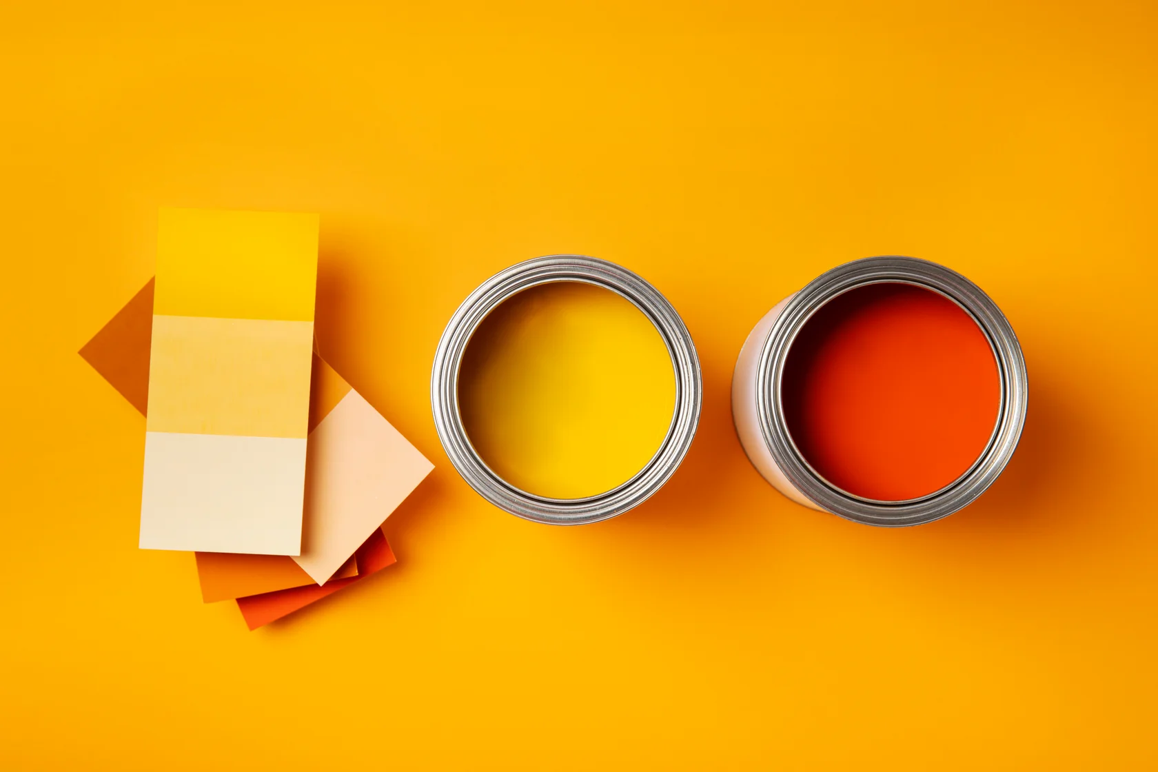
Warm colors: energy, warmth, coziness
Reds, oranges, yellows, warm browns. These are social colours. They stimulate conversation and appetite, which is why they work so well in kitchens and dining rooms. They advance visually too, making spaces feel intimate and gathered. I've used warm taupe in large, open living rooms where homeowners complained the space felt "like a warehouse." After painting? It felt like a room people actually wanted to sit in.
Cool colors: calm, focus, spaciousness
Blues, greens, purples, cool grays. These are bedroom and bathroom colours for a reason. They promote calm and recede visually, which makes small spaces feel more open. Blue is the most popular interior paint colour, and honestly? I get it. It works everywhere. Green brings that outdoorsy, grounding quality indoors—something a lot of Toronto homeowners respond to.
Neutral colors: the practical foundation
Whites, creams, beiges, taupes, grays. They're the canvas. Versatile, forgiving, and they appeal to almost everyone. Worried about resale? Neutrals are your safe play.
But here's what I want you to know: neutral doesn't mean boring. A warm greige (that gray-beige hybrid) feels completely different from a cool gray. The difference comes down to undertones—the subtle colour lurking underneath. A "white" can lean warm, cool, or slightly pink. Match those undertones to your flooring and cabinetry and the room sings. Miss them, and everything feels slightly off. People can't always pinpoint why, but they absolutely notice.
Best interior paint colors: room-by-room guide
Living rooms and common areas
Your living room sets the tone for the whole house. It's usually the first thing guests see. And let's be real—it's where your family actually lives.
Warm, inviting colours work best here. Think cream, taupe, warm gray-green. Want more personality? A warm terracotta, soft rust, or muted sage on one wall can be striking. Families tend to gravitate toward beige-tan-warm gray because those colours are forgiving (hide scuffs), feel spacious, and work with most furniture. If you prefer actual colour over neutral, lean warm for gathering spaces. Need professional guidance? Explore our interior painting services in Toronto or check out our comprehensive interior painting cost guide.
Bedrooms
Bedrooms are for rest. Your colour choices should prioritize calm over whatever's trending right now.
Cool tones dominate bedroom selections. And there's a good reason. Soft blues, pale greens, cool grays, muted purples—they all promote sleep and create a peaceful retreat. Warm whites and creams work fine too, but I'd steer away from oranges or reds. Had a client once who painted her bedroom a "muted" coral. Two weeks later she called me saying she felt like she was sleeping inside a sunset. Not in a good way. Pastel versions of your favourite colours tend to work well—just dilute the intensity. Bedrooms are also a great place to experiment with an accent wall.
Kitchens
Kitchens need colours that are energizing and practical. This is a workspace where you're dealing with steam, grease, and spills.
Warm whites, creams, soft yellows, and pale warm grays are kitchen staples. They feel clean, bright, and welcoming. Want a bit of character? Soft sage works beautifully in kitchens because it straddles the line between warm and cool. Pale blue-green is another solid option.
Skip dark colours in kitchens unless you have fantastic natural light and you're deliberately going moody. Most kitchens just feel better with lighter, airier colours that bounce light around.
Bathrooms
Bathrooms are usually small. Often windowless. Short on natural light. Let those constraints guide your colour choice.
Light colours are your best bet. Soft whites, pale creams, cool light grays, very pale blues or greens. They reflect what light you have, make the space feel bigger, and feel clean. Your bathroom has a window and good light? You've got more room to play. A soft spa-like blue-green or pale sage can work. But for windowless bathrooms, keep things light and cool.
Choosing neutral colors for resale value
If you're selling within the next five to ten years, neutral colors are the safest bet. The most broadly appealing interior paint colors are:
- Warm whites and creams - Classic, timeless, and work in every home style
- Warm grays - Sophisticated, contemporary, and versatile
- Greige - The perfect hybrid of gray and beige; warm yet neutral
- Soft warm taupe - Elegant without being trendy
- Cool light gray - Modern, fresh, and appeals to contemporary buyers
The key with neutrals is getting the undertones right. A warm white with yellow undertones feels completely different from a cool white with a hint of blue. Test both in your space before deciding.
Exterior paint color guide: creating curb appeal
Picking your home's exterior colour is a bigger commitment than interior. It's visible from the street. It defines your home's first impression. And Toronto homes? They come with their own challenges: hard winters, wildly different light across seasons, and architectural styles you won't find anywhere else.
How natural landscaping affects house color choices
Your landscaping should work with your paint, not against it. Look at what's permanent in your yard: tree bark, evergreen foliage, soil tones, garden schemes.
Mature trees with dark bark and cool-toned greens? Cool house colours like soft gray-blue or pale blue-green will feel harmonious. Warmer landscaping with golden leaves, russet bark, and warm evergreens? Warm house colours (warm gray, soft tan, warm cream) will complement that.
Popular exterior color combinations
Modern Toronto homes tend toward these combinations:
- Soft gray or greige house with white or cream trim - Contemporary, clean, universally appealing
- Warm taupe or warm gray with darker gray or black trim - Elegant and modern
- Soft charcoal or deep gray with white trim and natural wood accents - Sophisticated farmhouse style
- Warm cream or pale tan with darker brown or charcoal doors and shutters - Traditional, welcoming aesthetic
- Navy blue or dark blue-gray with white trim - Classic, timeless, beautifully versatile
Here's the biggest principle: make sure there's contrast between your house colour and trim. When they're too similar, the whole thing reads as muddy instead of polished.
Climate considerations for Toronto weather
Canada's climate is rough on exterior paint. You need to plan for it.
UV exposure fades colours over time. Dark colours fade faster. Go deep and expect visible fading in 8-10 years. Snow and ice make lighter colours appear even lighter and cooler in winter. That pale gray you picked in June? It might look nearly white next to January's snow banks and gray skies. Think about how your colour will look surrounded by all that white.
Rain and moisture are constant. Lighter colours show water stains more easily. Slightly darker colours can be more practical in wet climates, even if lighter ones are easier to maintain when it's dry. And here's the thing: the seasonal light shift in Toronto is dramatic. Colours that look perfect in summer can feel too cool or too heavy in December. If you can, visit paint stores during different seasons. Or ask to see samples in both strong summer light and weak winter light. For exterior cost planning, it's worth talking to professional painters who deal with these conditions year-round.
Curb appeal tips for house color selection
Your front door is a great place to create a focal point. Paint it a colour that coordinates with the house but stands out. A soft cream house with a deep charcoal or navy door looks intentional. Inviting. Done right.
Think about your roof colour too. Your house colour needs to work with the roof you already have. Dark asphalt roofs pair better with cool-toned house colours. Light roofs work with slightly warmer tones.
Here's the real talk: this is a high-commitment decision. Unlike an interior room you can repaint on a weekend, your exterior lives on your house for years. Pick something you'll still like in five years, not whatever's trending right now.
Before you commit, paint a large section of your house. Live with it for a bit. At minimum, look at it at different times of day and in different weather. See how it feels.
Professional tips for paint color success
Test colors before committing
Never paint a whole room based on a tiny paint chip. Those chips are designed to look good under store lighting. Here's what I tell every single client:
- Buy sample pots of your top two or three choices
- Paint big swatches—at least 2 feet by 2 feet—on different walls in the room
- Watch those swatches throughout the day: morning, afternoon, evening
- Check them under your artificial lighting too
- Live with them for a few days before deciding
This one step eliminates almost all colour regret. You'll see exactly how the colour behaves in your room with your light.
Understand paint finishes
Colour is only half the equation. The finish—how shiny or flat the paint is—changes how the colour looks and how it performs.
Matte or flat finishes absorb light, making colours look deeper and more sophisticated. Great for hiding wall imperfections. Not great for durability or cleaning. Best for bedrooms and low-traffic rooms.
Eggshell has a subtle, velvety sheen. More durable than matte, still forgiving on imperfections. A lot of homeowners pick eggshell for living spaces because it balances looks with practicality.
Satin has noticeable sheen and reflects more light. Very durable, easy to clean, perfect for kitchens, bathrooms, and high-traffic areas. It does show wall imperfections more though, so prep work matters.
Gloss and semi-gloss are shiny, extremely tough, and easy to clean. Best kept to trim, doors, and cabinets. On full walls, they can feel like the inside of a balloon.
Here's the thing: the same colour in matte looks noticeably different in satin. Factor the finish into your testing. For the full breakdown, see our complete guide on paint finishes.
Common paint color mistakes to avoid
Ignoring undertones. Not all whites are the same. A white with yellow undertones looks completely different from one with blue undertones. Match your white to your flooring, cabinetry, and trim. This matters more than you think.
Painting based on small samples. The colour on a 2-inch chip looks different covering all four walls. Always test larger swatches. Always.
Chasing trends. That millennial pink or trendy sage green might feel dated in three years. Pick colours you genuinely love, or accept that you'll be repainting sooner.
Forgetting about lighting. The most beautiful colour under perfect light might look dull or overwhelming in your actual room. Testing in your space is non-negotiable.
Treating all grays as neutral. Some grays have warm undertones, some cool, some slightly pink. If you don't match undertones to your existing elements, things will clash.
Using one colour everywhere for "flow." While flow matters, every room has different light and a different purpose. A colour that works in your living room might feel wrong in your bedroom. Each space deserves its own consideration.
Making your final color decision
Here's the action plan:
- Assess your space. Look at natural light, room size, existing decor, and what the room is for.
- Pick a direction. Warm or cool? Bold or neutral? Contemporary or traditional?
- Choose two or three candidates that appeal to you and fit the room's characteristics.
- Test them properly. Paint large swatches and observe them at different times of day and in different weather.
- Think long term. If resale matters, lean toward timeless neutrals. If this is your forever home, paint what makes you happy.
- Commit. Once you've tested, trust the process and go for it.
And here's what people forget: paint is one of the most reversible decisions you can make in your home. Hate it six months later? You repaint. Not ideal, but far from permanent. That alone should take some pressure off.
Need professional help with colour selection and execution? Explore our interior painting services or request a free quote to bring your vision to life.
The bottom line
Choosing paint colours well comes down to understanding the technical factors—light, room size, existing elements—while trusting your own eye. Whether you're picking interior colours for a home refresh or exterior colours for curb appeal, the same principles hold: test thoroughly, pay attention to undertones, and think about how light moves through your space.
The best-painted homes are the ones where the colours feel right to the people living there. Follow these strategies and you'll end up with colours that look good, age well, and make your home feel the way you actually want it to.
Frequently Asked Questions
North-facing rooms receive cool, indirect light that can make colors appear darker and cooler. Choose warm tones like soft yellows, warm beiges, warm grays with yellow/beige undertones, cream whites, or muted terracotta to counteract the cool light. Avoid cool blues or grays which will feel cold and unwelcoming in north-facing spaces.
The most universally appealing neutral colors are warm whites and creams (classic, timeless), warm grays (sophisticated, contemporary), greige (perfect gray-beige hybrid), soft warm taupe (elegant without being trendy), and cool light gray (modern, fresh). These work in every home style and appeal to the broadest range of buyers.
Not necessarily. While color flow matters, every room has different light and serves different functions. A color perfect for your living room might feel wrong in your bedroom. Each space deserves its own thoughtful color choice based on natural lighting, room size, and function. However, keeping finishes consistent across open-concept spaces creates visual cohesion.
Purchase sample-size paint in your top 2-3 choices. Paint large swatches (at least 2 feet by 2 feet) on different walls in the room. Observe these swatches throughout the day—morning, afternoon, and evening—and in artificial light. Live with them for at least a few days before deciding. This simple step eliminates almost all regret about color choices.
Light, cool colors make rooms feel more spacious: soft whites, pale blues, light grays, pale greens, and pastel shades. These colors recede visually and reflect light, creating an airy, open feel. Avoid dark colors on all walls—instead, use one darker accent wall to add depth without closing in the space.
Extremely important. Not all whites are equal—a white with yellow undertones looks completely different from a white with blue undertones. Undertones determine whether a neutral feels warm or cool. Match your paint undertones to your existing elements (flooring, cabinetry, trim) to ensure harmonious color relationships. Test samples to identify undertones in your specific lighting.
For Toronto weather, choose durable colors that resist fading: soft gray or greige with white/cream trim (contemporary, clean), warm taupe with darker gray/charcoal doors (elegant, modern), deep gray with white trim (sophisticated farmhouse), or navy blue with white trim (classic, timeless). Avoid pure matte finishes—use satin or semi-gloss for better moisture resistance and UV protection.