


How to choose the best wall for an accent wall placement
Quick Answer: The best accent wall depends on three core factors: where it naturally draws the eye, whether it anchors a significant focal point, and how light moves through your space. Pick the wall opposite your entrance, walls backing furniture anchors (beds, TVs, sofas), or walls with architectural features like fireplaces. Avoid walls choked with windows, doorways, or existing artwork that'd compete for attention.
Here's the backwards thinking I see all the time: people pick a colour at the paint store first, then hunt for a wall to dump it on. I've watched it happen dozens of times. Someone falls in love with a deep navy. Gets home. Tries it on a wall full of windows. Suddenly that gorgeous colour looks muddy and fragmented. The paint wasn't the problem. The wall was.
Here's the real truth: placement beats colour every single time.
A beautiful sage green on the right wall becomes the room's whole personality. That exact same sage on a wall with a door and two windows? Looks like you just ran out of ideas. When you nail the placement and pair it with thoughtful paint color selection, the transformation feels inevitable.

Why accent wall placement matters more than paint color
When you walk into a room, your eye follows specific paths. Shaped by the architecture, furniture layout, and natural sightlines. A well-placed accent wall placement works with those patterns, not against them. It feels intentional. Like someone who knows what they're doing made the decision.
A poorly placed one? It fights the space. The room feels off in a way you can't quite name.
Beyond sightlines, placement also accounts for light behaviour, traffic patterns, and what's already grabbing attention. Bold colour on an afternoon-facing wall reads completely different than the same shade on a north-facing wall. A wall drowning in windows? Your eye just drifts right through the glass to the outside. The colour never lands.
That's the gap between a room that looks genuinely designed and one that looks like someone tossed darts at the wall.
The four wall selection criteria for choosing an accent wall
Before you even think about colour, evaluate your walls on these four points. Get these right and the rest follows naturally.
1. Entrance visibility and first impressions
The wall you see first when you walk in? That's usually your strongest candidate. Almost always the wall directly opposite the door. The one your eye naturally lands on as you cross the threshold.
That first wall gets maximum visual impact because it's literally the first thing people's brains register. It sets the room's entire vibe. In Toronto apartments and tighter spaces, pay attention to sightlines from the hallway or entryway. If it's blank and uninterrupted—you've probably found your wall.
2. Architectural and structural focal points
Here's where natural architectural features become your best friends. Built-in focal points make the colour feel purposeful instead of random.
A fireplace wall is the textbook example. The fireplace already commands the room's energy, so a bold colour behind it feels earned. It reinforces what's structurally the room's anchor. And yeah, understanding how sheens interact with dramatic colour absolutely matters.
Floor-to-ceiling shelving or built-in bookcases? The wall behind them works beautifully. That shelving adds texture and visual complexity. Keeps the colour from feeling flat or one-dimensional.
Exposed brick, shiplap, wood panelling, stone features—these are focal points on their own. Painting the wall behind them, or building the accent wall around them, creates a layered depth. Materials catch light differently than flat paint alone can. Dimension that photographs actually do justice to.
Angled or vaulted ceilings? Same story. Built-in architectural drama that draws the eye up. Especially in older Toronto homes with real character, an accent wall there becomes a genuine conversation piece.
3. Furniture anchors and visual hierarchy
Look at where your furniture sits. Often that's exactly where your accent wall should go. Designers call it "visual anchoring." It's fundamental.
Big sofas, substantial bed frames, wall-mounted entertainment centres—these anchor the room visually. Paint the wall behind them and you create a framing effect. Ties the furniture to its backdrop like they belong together. This is why the wall behind the bed works in bedrooms so consistently. The bed is already doing the visual heavy lifting. The colour just reinforces it.
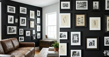
Gallery walls or artwork partway up a wall? The space above becomes an accent zone. Creates separation. Keeps the colour from wrestling with what's already there for attention.
4. Light exposure and colour behaviour
Here's what most people miss until the paint's already on the wall: lighting completely changes how colour actually performs.
North-facing walls get consistent, cool light all day. Colours read more muted, cooler-toned than on the paint chip. Want something bold that really pops? North-facing walls make that harder. Stick with grounded colours—charcoal, deep sage, warm taupe.
South-facing walls get intense warm light, especially afternoons. Bold colours intensify. Can feel overwhelming if you're not careful. Warm yellows, corals, turquoises work here, but test thoroughly. Perfect at 10 AM? Could feel like too much by 3 PM.
East and west-facing walls shift through the day. That actually gives colours complexity. East gets warm morning light. West gets warm afternoon. Versatile. Forgiving.
Walls with multiple windows or glass doors? Skip them entirely for accents. Windows fragment the colour. Your eye just drifts through the glass instead of settling on the wall. You lose the whole effect.
Room-by-room accent wall strategy guide
Different rooms do different work. Your accent wall should earn its place.
Living rooms and family spaces
Living rooms are where interaction happens. The accent wall needs to support conversation and comfort, not compete.
Best spot? Usually the wall behind main seating, or the wall visible from where people actually sit. Creates a cohesive backdrop for people to talk and relax. Entertainment centre wall works too. Just don't overload one wall with accent paint and art and photos and a TV. Visual chaos happens fast.
Bedrooms
Your bedroom accent wall strategy should feel restful first, designed second.
The wall behind the bed is the obvious choice. And honestly? It's obvious because it works. It's the dominant visual element when you're lying there. Gets maximum sightline focus. Creates a naturally framed feeling. I've seen this rule hold true in almost every bedroom layout over twenty years of painting in Toronto.
Bed on a windowed wall? Try the wall you see first when you wake up instead—directly opposite the bed. Skip walls with doors or closets. They shatter the visual impact.
Home offices and workspaces
Here the accent wall should help focus without fatiguing your eyes visually.
Put it directly behind your desk or on the wall you face while working. Dark, grounded colours shine here: charcoal, deep teal, navy. They support concentration without black's heaviness or white's sterility.
Desk faces a window? Accent wall goes behind you. Face a wall already? That's your accent wall. Position the colour to support focus, not create glare on your screen.
Kitchens
Kitchen accent walls demand thoughtfulness. Kitchens are visually complex. Cabinets. Appliances. Countertops. Backsplashes.
Hunt for an uninterrupted wall opposite the main work area, or the wall visible from the dining space in open-concept layouts. The wall above an island creates a unified focal point. Works nicely.
Skip the wall behind the stove. Heat, steam, cooking splatter degrade paint durability. Plus the visual chaos of active cooking means the colour just disappears anyway.
Bathrooms
Small bathrooms. Moisture-prone. Options feel limited, but they're not eliminated.
The wall behind the sink becomes a backdrop for your reflection. The far end wall in a longer bathroom draws the eye in. In tiny bathrooms, one bold accent wall actually outperforms painting all four walls the same colour.
Remember: bathroom paint must handle moisture and mildew. Bold colours show water spots more obviously. Factor that into your choice.
Accent wall colour selection: Beyond the paint chip
So you've picked your wall. Now the colour conversation gets clearer. But it's not just about picking what you like.
Contrast vs. harmony
Two basic strategies exist.
Contrast is bold. You pick a colour clearly different from your other walls. Deep jewel tones against neutrals. Rich charcoal against cream. Emerald against pale grey. Reads as intentional. Creates immediate impact. Works especially well in rooms with strong architectural features that anchor the boldness.
Harmony is subtler. You pick a colour that relates to existing walls but goes deeper. Richer. Slightly different in tone. Warm taupe accent with pale taupe walls. Warm grey with cool grey. Muted sage with cream. Creates depth without shock. I recommend harmony for spaces where bold colour might feel excessive—bedrooms and bathrooms especially.
The three-step colour testing process
Never pick accent wall colour from a paint chip alone. I've seen too many people regret it—trust me.
Step 1: Buy sample pints of your top two or three choices. Costs $15–30. Cheap insurance against a $200+ mistake.
Step 2: Paint large test swatches on your chosen accent wall. Two feet by two feet minimum. You need to see actual colour on your actual wall in your actual light. Tiny swatches tell you nothing useful.
Step 3: Live with those swatches for a couple days. Morning light. Midday. Afternoon. After dark with your regular lights on. Colours shift dramatically through the day. Perfect at 8 AM? Could feel completely wrong by dinner. Toronto's seasonal light variation makes this step even more critical.
Accent wall colour psychology: Match colour to room function
Placement comes first. But colour still needs to support what the room actually does.
Relaxation spaces (bedrooms, bathrooms) need cool tones. Soft blues. Muted greens. Pale lavenders. Gentle greys. They literally lower visual temperature. Skip bright reds and oranges—those activate your nervous system rather than calm it.
Social spaces (living rooms, dining rooms) thrive on warm tones. Terracotta. Warm red. Deep gold. Colours that feel inviting. Make people want to stay. For budgeting accent wall painting costs, check our interior painting cost guide.
Productive spaces (home offices) demand deep grounded colours. Navy. Charcoal. Forest green. Burgundy. Support sustained focus without coldness.
Creative spaces (studios, hobby rooms) can handle bold saturated colours. Deep teal. Rich purple. Vivid emerald. Intensity is the point. Energy and expression are the whole reason.
Accent wall placement do's and don'ts
DO:
- Choose walls with natural focal points (fireplaces, built-ins, major furniture)
- Paint the wall you see first when entering the room
- Test colours through complete light cycles before committing
- Consider full wall height when planning bold colours. Floor-to-ceiling accent walls carry more visual weight
- Pair accent colours with the right paint finishes (matte for modern, satin for contemporary, soft sheen for traditional)
- Use primer when going from light to dark colours for true colour accuracy
DON'T:
- Paint walls with multiple windows or glass doors. The interruption defeats the purpose
- Choose walls already busy with furniture or artwork. Visual competition creates chaos
- Paint walls that contain entrance doors. Doorways fragment the visual statement
- Apply extremely bold colours to north-facing walls unless you specifically want a muted effect
- Ignore light exposure during colour selection. It determines how the colour actually looks
- Paint more than one accent wall per room in most cases. One focal point is almost always stronger than two competing ones
- Choose colours from paint chips or online images alone. Real world testing is non-negotiable
Professional application techniques for flawless accent wall results
You've chosen your wall. Now execution is what separates professional from homemade.
Surface preparation for accent walls
Fill imperfections with spackling compound. Sand smooth. If you're covering light colour with something dark, prime first. Primer prevents three-coat hell and ensures true colour.
Mask edges with painter's tape along ceiling, baseboards, adjacent walls. Apply it firmly. Remove while paint is still tacky—not fully dry. That's how you get crisp lines without peeling.
Paint application strategy
Finish matters. Matte is modern, hides imperfections, but shows fingerprints. Eggshell is versatile, slightly washable. Satin is my go-to for accent walls because it handles light reflection beautifully and cleans easily. Semi-gloss works in kitchens and bathrooms but reads too shiny in living spaces.
Two coats is standard. Dark accent colours might need three, especially over light base colours. Let each coat dry fully between—usually 2–4 hours depending on humidity.
Use quality tools. Two to three inch angled brush for edges. 3/8-inch nap roller for smooth walls. Half-inch for textured walls. Cheap brushes leave streaks. Cheap rollers shed lint. Not worth saving fifteen bucks on tools when you're investing in premium paint and labour.
Common accent wall mistakes (and how to avoid them)
Choosing colour before placement. This backwards approach—I warned you at the start. Pick your wall first based on structure and sightlines. Then find the colour that makes that wall sing. Otherwise you're jamming a favourite colour onto a wall that doesn't deserve it.
Ignoring existing decor competition. Bold accent wall behind twenty framed photos? The wall fights every single photo for attention. Wall colour becomes background noise instead of focal point. Clear the clutter first. Or pick a less busy wall.
Painting a wall with doors or windows. Doors and windows fragment visual impact. They interrupt the colour. Prevent the wall from reading as one statement. This is the most common mistake I see homeowners make.
Going too bold in small spaces. Fully saturated accent colour in a tiny bathroom feels claustrophobic. Small spaces need slightly muted versions of your choice. Save intense saturation for larger walls where colour can actually breathe.
Skipping the test phase. Paint samples cost twenty to thirty bucks. Repainting a wall you hate? Costs ten times that plus months of frustration. Testing isn't optional. It's the cheapest insurance in the whole project.
Accent wall colour trends for 2026 (and what actually lasts)
What's working right now in Toronto:
Deep, moody colours are holding strong. Charcoal. Forest green. Deep teal. Warm navy. Feel sophisticated. Work with modern and traditional equally. I've painted more dark accent walls in the last two years than the previous ten combined.
Texture is genuinely coming back. Suede-finish paints. Faux finishes. Accent walls paired with wallpaper. Flat colour feels less interesting alone than colour combined with something tactile. Different finishes completely change how accent wall colours read, and people are actually paying attention now.
The winning formula right now: bold accent walls with very calm, neutral surroundings. You get visual drama without overwhelming the space.
Toronto-specific reality: Colours that work year-round beat trendy picks that look amazing in summer and awful under January's grey light. After twenty years here—north-facing condo walls in January are merciless. Pick something that handles all four seasons.
Room function is driving colour choices more than trends. Calming colours for bedrooms. Energizing colours for kitchens. Focusing colours for offices. Form follows function. Not a new idea. But more people are actually doing it now.
Decision framework: How to choose your accent wall systematically
Work through this methodically:
Identify natural sightlines in your room. Which wall do you see first? Which one anchors the space visually?
Assess architectural features. Fireplaces? Built-ins? Focal points? Those are your strongest candidates.
Evaluate light exposure. North, south, east, or west? How does light move through the day?
Test colour choices thoroughly. Buy samples. Paint large swatches. Live with them for a couple days.
Verify your reasoning. Are you choosing the wall that makes structural sense, or just the convenient one?
Commit to quality execution. Proper prep. Primer where needed. Good technique. Colour only works if application is solid.
The best accent walls feel inevitable when they're done. Like the wall was always supposed to be that colour. You just figured it out. That's the goal: placement that makes logical sense and colour that feels right. Room feels complete and genuinely yours.
Ready to bring your accent wall to life? Contact our professional painters for expert guidance and flawless execution.
Frequently Asked Questions
Light colors like soft whites, pale blues, light grays, and pastel shades make rooms feel more spacious by reflecting light. Lighter tones on walls create an airy, open feel that visually expands the space. Painting the ceiling the same light color as the walls can make ceilings appear higher. For maximum impact, pair light wall colors with minimal clutter and good natural lighting.
Accent walls are ideal when you want visual impact without overwhelming the space, have a natural focal point (fireplace, headboard wall), or want to experiment with bold colors affordably. Paint all walls when you want a cohesive, unified look, the room needs a complete color refresh, or you are working with neutral tones. Most homeowners choose one accent wall plus three neutral walls for balance.
The best accent wall is typically the wall you see first when entering the room (directly opposite the entrance), walls with architectural features like fireplaces or built-ins, the wall behind the bed in bedrooms, or the wall behind the TV or sofa in living rooms. Avoid walls with too many windows, doors, or clutter. The accent wall should naturally draw attention.
For bedrooms, choose calming colors that promote relaxation: soft blues and greens (calming, reduce stress), warm neutrals like beige or greige (cozy, versatile), muted lavenders or soft grays (serene, sophisticated), or pale blush or sage (gentle, modern). Avoid bright reds, oranges, or bold yellows in bedrooms as they can be too stimulating for sleep. Test paint samples on your wall and observe them in morning, afternoon, and evening light before deciding.
Yes, accent walls are easy to change. Since you are only repainting one wall, it costs significantly less than repainting the entire room. Changing an accent wall typically costs $150–$300 depending on size and paint quality. This makes accent walls perfect for experimenting with trends or seasonal color changes without major commitment. Simply paint over the existing color with primer (if changing from dark to light) and two coats of your new color.